Material Design Color Selector
Overview
In order to ensure that the color scheme of your KwikWork installation appeals to a broadest cross-section of users, the implementation of a palette that is based on the material design best practices is recommended. Below are color swatches that would help in the creation of a theme that employs material design best practices. The color swatches are divided into two sections: the primary colors spectrum at the top and the accents at the bottom. It is recommended that the 500 color be used as the main primary color for the theme and should be the color of the the KwikWork main navigation bar. It is good practice to select no more than three hues from the primary palette and a single color from the secondary palette for the accents(color 4 in the theme creator). Areas where primary colors should be used are the headings, bars, and backgrounds, while accent colors should be used in the highlights, underlines, buttons and bubbles. To make accent elements such as button and bubbles more vibrant, use a color from a different color group such as using a red accent with blue primary colors.
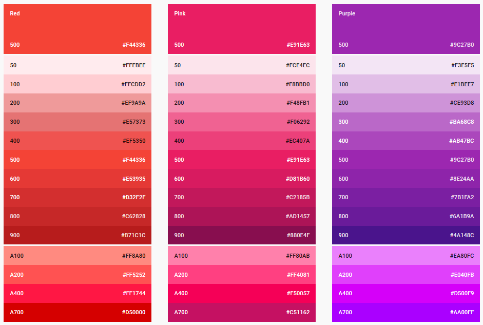
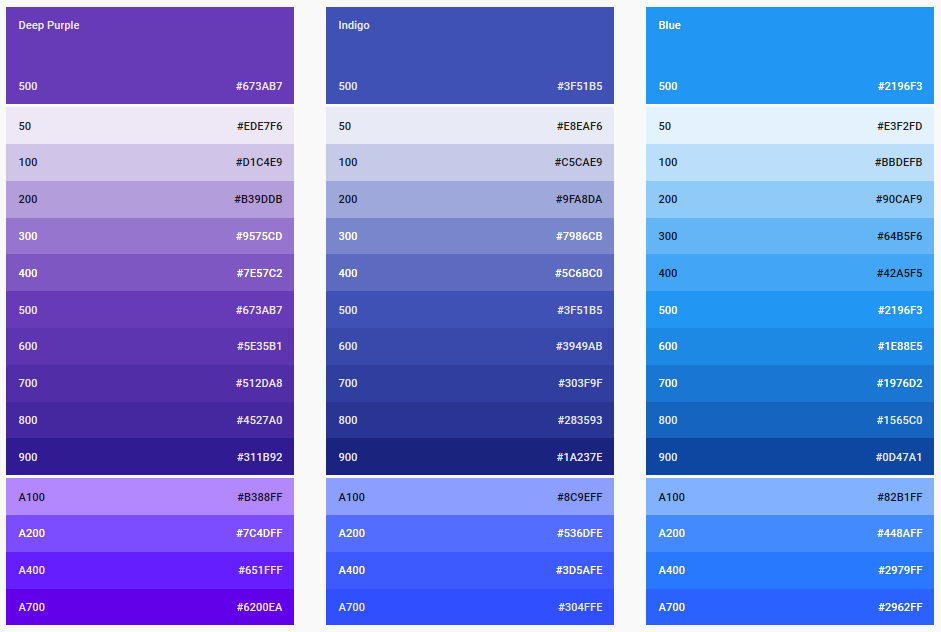
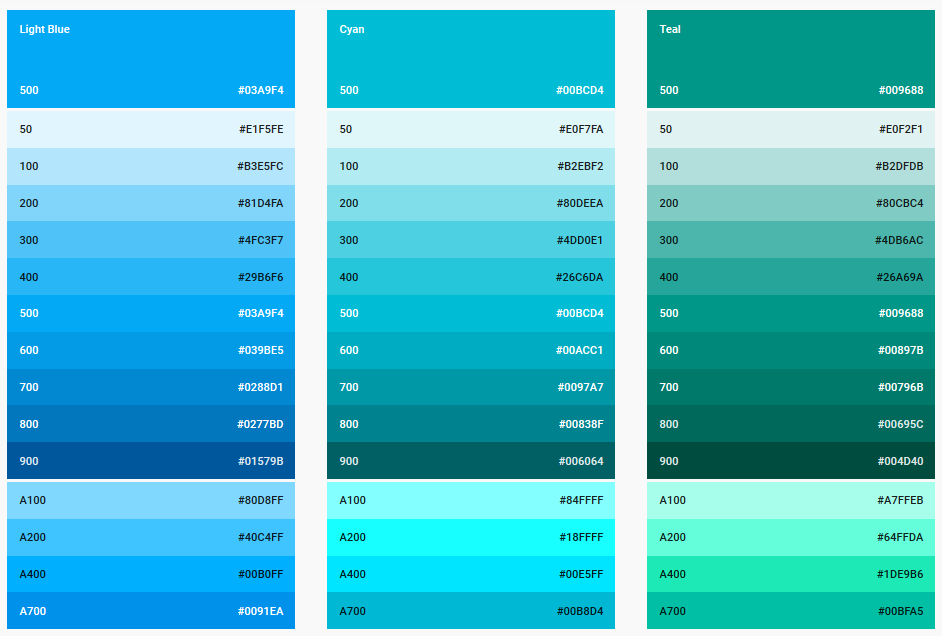
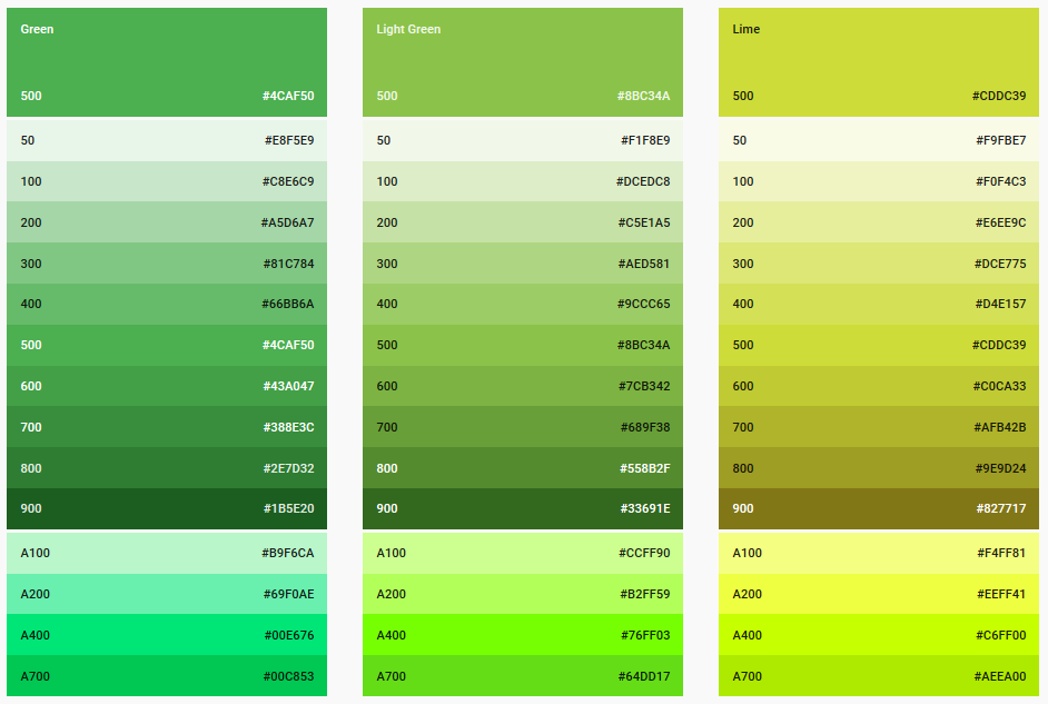
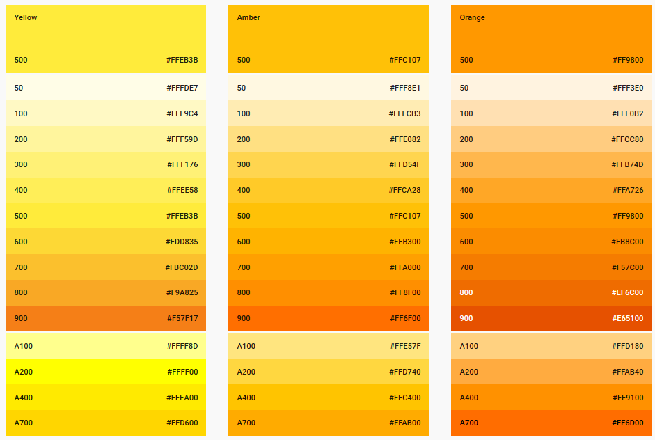
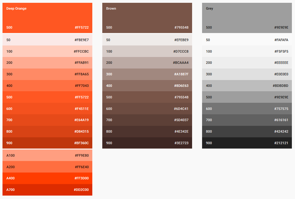
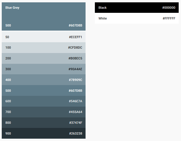
- Color swatches are based on Google Material Design research.
- Material Design Palette https://www.materialpalette.com