KwikWork UX Theming
Overview
KwikWork for ICN extends the theming capability introduced with ICN 2.0.3. Using the IBM theme configuration GUI, users can set a color palette and an application font that applies to KWCN. KWCN requires a ten color palette in which the order and function of each color has significance.
The KwikWork color palette leverages the latest research on material design color guidelines so that they appeal to a broader variety of users. It is therefore recommended that in creating your own themes that you follow these guidelines.
Configuration
The pictures below show the locations where each color within the palette is used. Any locations not included are not adjustable from the color palette.
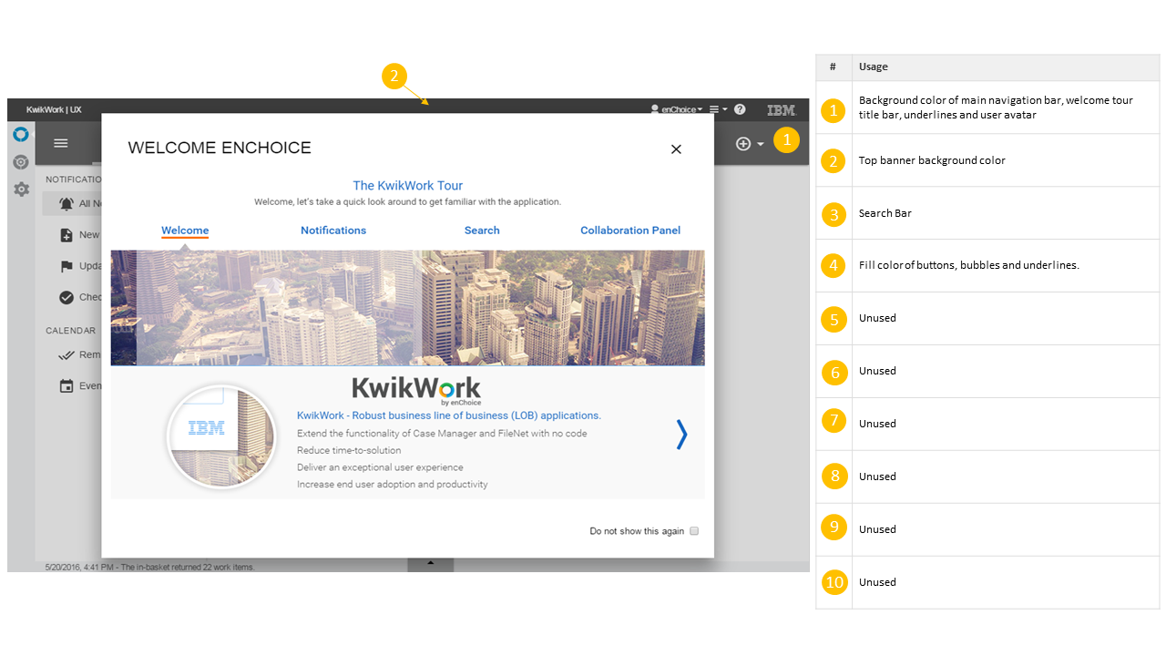
Welcome Screen
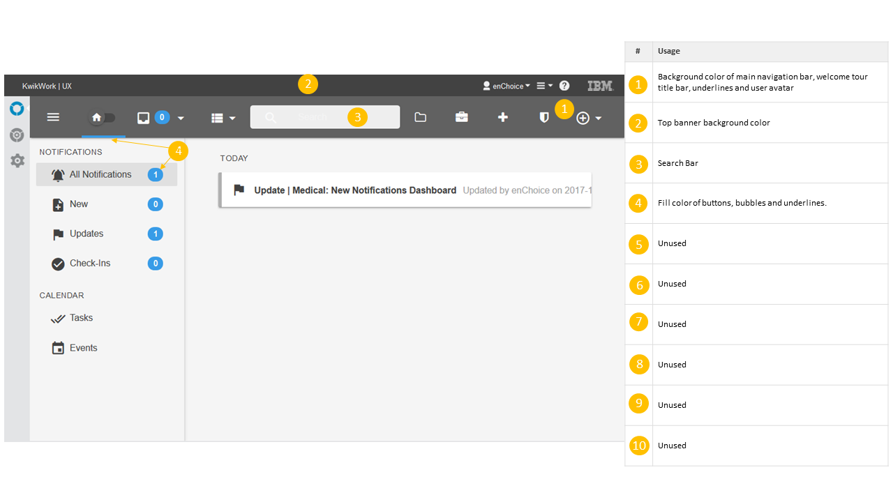
Home Screen
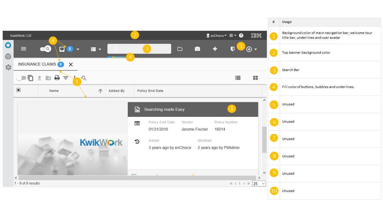
Search Screen
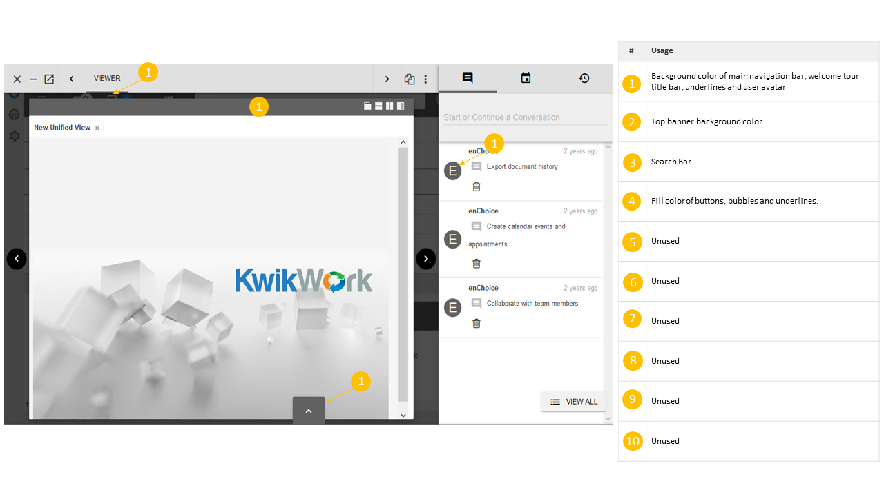
Document Unified View
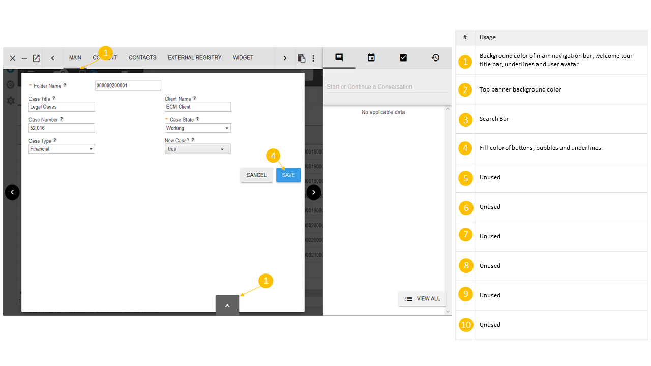
Case Tabbed View
Creating a new Theme
Themes can be created from the IBM Content Manager settings by performing the following steps.
Step 1
Open the IBM Content Manager Settings by clicking the settings icon on the left vertical navigation bar, then click the 'Themes' link to open the Themes tab.
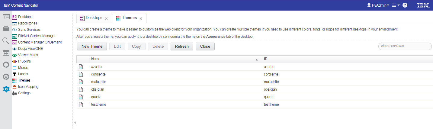
Step 2
Click the 'New Theme' button to open the theme configuration window. You will first need to specify the name for the new theme as well as the theme ID.
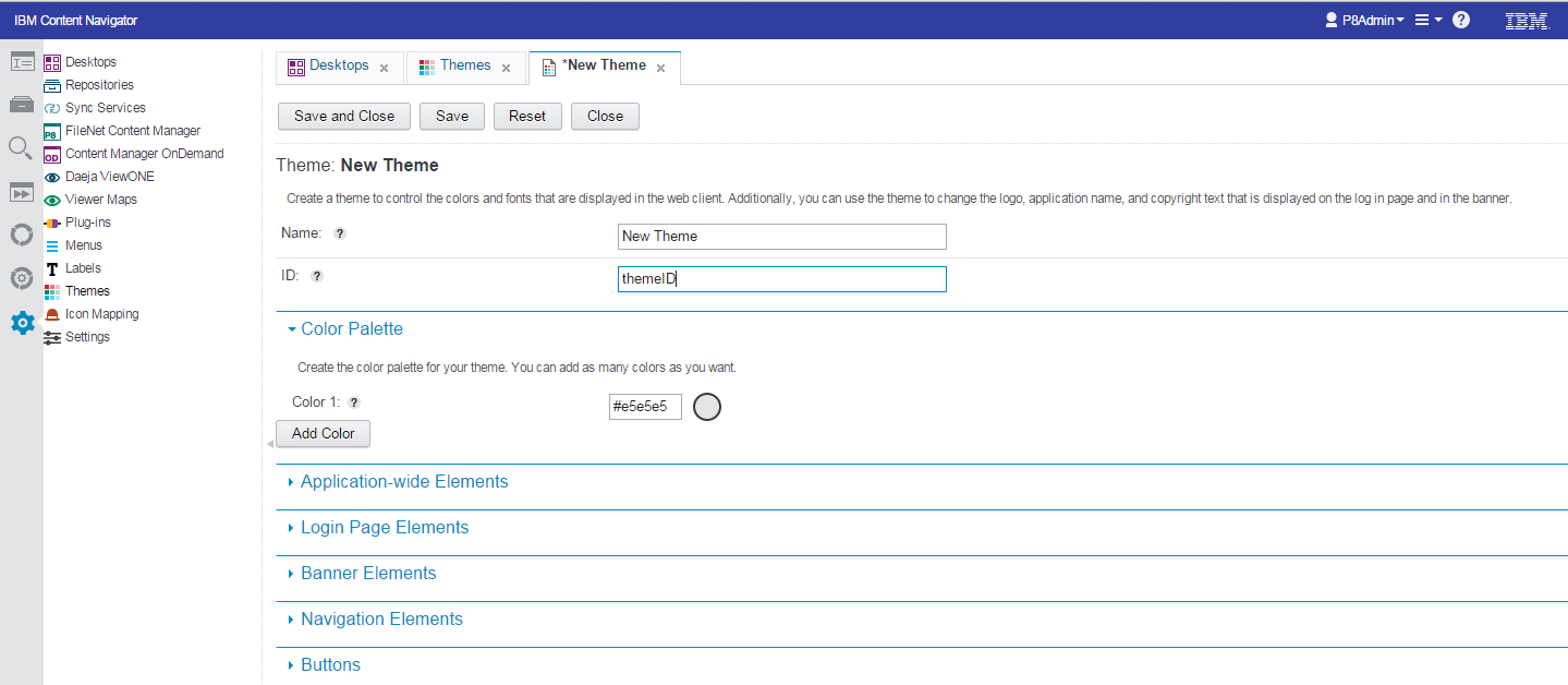
Step 3
By default, the theme only has a single color within the palette. It is therefore necessary to add the remaining 9 colors to complete the color palette. The Google Material Design Color guidelines should be used when selecting the colors. A link to the guidelines can be found in the resources section at the bottom of this page.
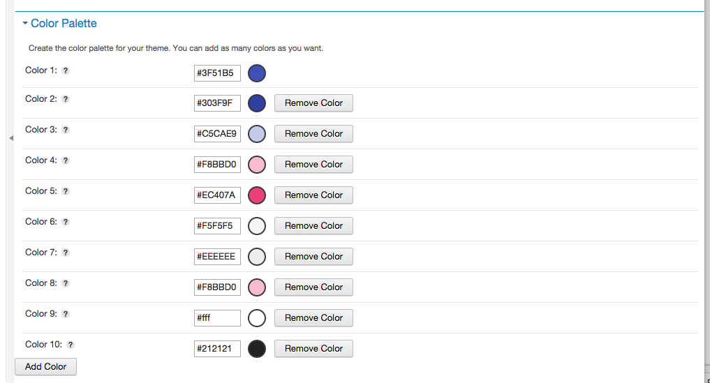
Step 4
Click save and close. The newly created themes can then be applied to your desktop.
Resources
- For hex codes and bast practices use the Material Design Color Selector
- Here is the meaning of each color:
| # | Usage |
|---|---|
| 1 | Primary background color of main navigation bar and user avatars |
| 2 | Top banner background color |
| 3 | Background color of search bar |
| 4 | Accent color used as fill color of buttons, bubbles and underlines |